How To Design In App Purchase
How to design in-app-purchase experience?
![]()

Prelude
Most of the business model for mobile applications is through in-app-purchase ( abbreviation as 'IAP' in rest of the article) to increase revenue, thus, a great experience for IAP directly influences whether user paid for it or not.
If you don't have any idea of in-app-purchase, then here is a speech launched by 2014 Apple WWDC for you to take a quick glance at. This speech provided lots of examples for designing a great in-app-purchase experience.
You will find some lear n ings and tips for designing IAP experiences in this article, those tips can be applied to any products for short-term effects. However, it's more important that your product actually relieve some pain for users, and they are willing to pay for your treatments.
In-app-purchase can be mainly divided into two types: Consumable & Non-consumable, and Subscriptions.
Consumable & Non-Consumable
Easier for users to evaluate what they would receive after purchase.
Consumable and non-consumable are both paid once, the difference is the product properties. Consumable product is depleted and can only be used once, such as lives or gems in a game. Non-consumable product once been purchased won't be expired, like filters in camera app, or magazine in book app.
If you would like to increase the conversion, you can follow the flow that user been through, promoting products by providing what they might be lack of, or based on storyline to give some of the add-ons, that user would have higher possibilities to purchase.
Subscriptions
Considerations needed for user to evaluate the level of needs versus price.
Most of the subscriptions are provided by tools apps, and tools apps usually serve 'nice to have' functions. Thus, compare to consumable IAP, subscriptions IAP are more difficult to promote, as they have higher price and long-lasting time, user tends to take more time to evaluate the value between their needs and the money they paid.
In terms of increasing conversion rate for subscriptions IAP, defining the core value of product would be the top most task in the beginning.
How is your product retention?
Who is your hardcore fans, and what kind of features in your product they are positively appreciated and regularly used?
Furthermore, you can motivate those hardcore fans to subscribe by optimizing and enhancing those features which perfectly just right fit them.
Then, how to raise user's desire?
Here are some strategies could help.
- Provide free trial
Free trial gives the chance for users to experience your product. It's like free samples in supermarket, if you have positive experience after trying the samples, you are more likely to purchase the product, so-called free sample strategy.
2. Community identification

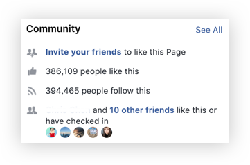
People tend to trust the community when they are making a 'not so familiar' decision, so lots of promoting skills are dealing with this, such as best seller, sales rankings…etc.
It's common to use UI to manipulate by showing like ' Your friends also like this' and '30 people are viewing this with you'.
3. Visualize the advantages
Converting the advantages into actual numbers and take good use of comparison, like 'save up to 30% on this', '3 times faster than before'…etc, or listing out what they will get after purchasing.
4. Scarcity: time-limited, quantity-limited, access-limited
Scarcity basically make the most of human nature, as what hurts the most is not the feeling of missing the cheapest price, but the feeling of losing control. People would blame themselves for the wrong decision, as they had chance to make it right.
Moreover, people are used to imagine the consequences after the decision. In order to prevent themselves from feeling regret, they might choose the one which considered to be better for them.
Scarcity also build the product to high-quality and high-demanded level, as no one would deadly want the product has low-quality. This strategy is known as Hunger marketing.
Based on those strategies above,
there are some conclusions provided for designing an in-app-purchase experience.
1. Verify the product value by letting user try first
Make user meet your product for the very first time, then trigger their curiosity for further functions. If they get hooked and are willing to pay or do labor (such as watching ads) to get more, you can have the conclusion that they buy in your product value.
2. Help with the decision
When user are ready to purchase, and just hesitating on which they should choose, then it's time to use UI design for helping user make decisions.
- Ratings & Comments:
Ratings & comments represent community identification. It helps user to make the decision base on community suggestion. Also, high-rating is the synonym of high quality. - Red color:
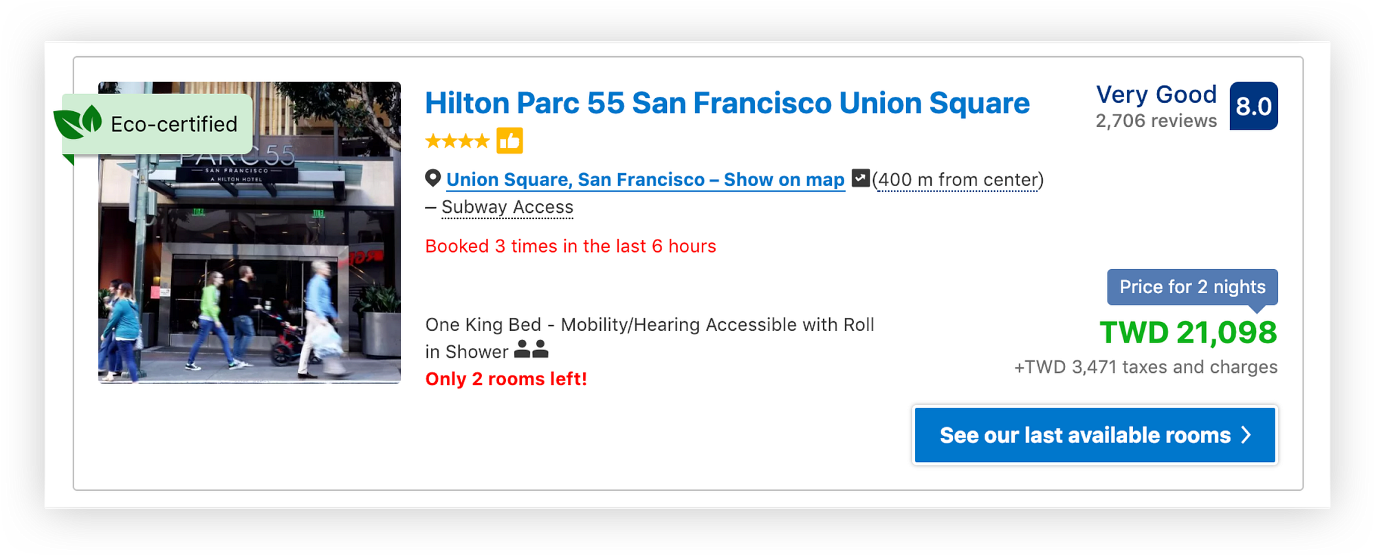
Color itself contains emotion. Red is warm, bright, and excited, also considered to be intense. Usually we use red to convey important messages, like warning and error. The example of booking.com below use red texts to make the intensity, bringing out the scarcity of rooms and let user feel the urgency to book.

- Comparison:
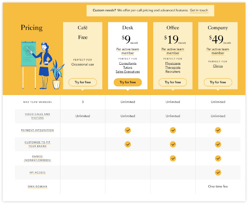
According to your business goal, empathizing the one you want them to buy by using slightly different color or pattern from other options.

- Do the math:
Helping user by doing the math. Tell them how much they can save, or how much discount they have if they choose the price could positively help user to make the decision.

These tips might be defined as dark patterns in some terms, as they are doing something like 'pushing' people. However, user always have the choice to pay or not. These tips can help for short-term conversion, but long-term focus should be on your product value which can actually help to achieve the business goal.
If you like this article, please do not hesitate to give me some claps ;)
How To Design In App Purchase
Source: https://medium.com/@phoebechen9068/how-to-design-in-app-purchase-experience-e6eac5003ad3
Posted by: yeagerfamery.blogspot.com

0 Response to "How To Design In App Purchase"
Post a Comment